Belafonte: all on deck
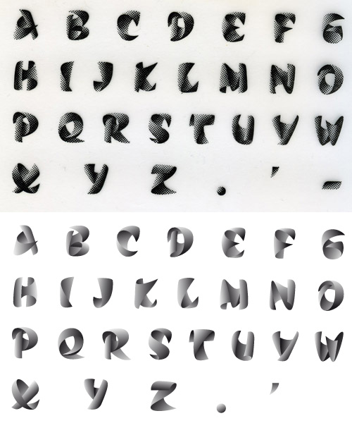
Belafonte was only a student’s attempt to give a second breath to one of the most strange and amusing typefaces designed by Roger Excoffon, Calypso. Some have tried revivals, sometimes wanting to be accurate, but never in a convincing way. Personally, I find the dotted grayscale bears too much of an ending-fifties nostalgia I’m not comfortable with, that’s why I decided to try and extract the visual spirit of the typeface in order to offer something that would be more of an homage than a revival. This is what explains the use of another name.

Specimen of the Olive foundry from which I drew the primary shapes.
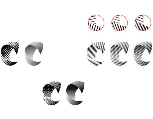
The principle I chose is quite simple. I use another expression of optical grayscale that seems less out-of-date aiming to give the typeface a new appearance while conserving its dynamic specificities and the vision of volume expressed by the letterforms and gradients. After some wandering, I ended up using a gradient shape tool, common in Adobe Illustrator, in order to obtain optical grayscales that could be easily tweaked. The final goal was to find a system that would allow for the creation of a ‘normal’ font file.

Various attempts to render the gradients properly in grayscale.
Eventually, I didn’t find the time (or patience ?) to develop the font seriously, but the basic work having been done and the use of it being possible to a certain extent, I imagined releasing my working files and the few achievements as an open-source bundle for the pleasure of some friendly nerds. What had stayed in the dominion of imagination now becomes real through the compressed file I provide today, containing a very basic font and some vector files that will allow enthusiasts to play around with what I’ve done this far, even modify, expand or improve…
It is to be noted that this creation (originally Calypso) was never meant to be a complete typeface, merely a gathering of dropped caps or swash letters intended for titling uses. This is why I didn’t try to develop a complete typeface, as some have tried, for I would consider this enterprise quite absurd. I took the time though, to draw numbers and an ampersand, as well as accents (for capitals are meant to be accented, yes).
This work is released under the terms of the Creative Commons license allowing any commercial or non-commercial use and any modification as long as the result remains under the terms of the license, i.e. shared freely (I might add, free of charge). Mentioning me as the primary author would also be nice, or let me put it this way, the license requires it. This being, I have better things to do than to sue you if you don’t.
For the record, and for the newly come audience, the name Belafonte is a direct reference to Steve Zissou’s ship in Wes Anderson’s The Life Aquatic. The ship itself refers to Jacques-Yves Cousteau’s boat, the Calypso. As for the link between the two names, I leave this riddle to your good solving care, there’s enough info about that on the internet.

Belafonte by Loïc Sander is released under the terms of the Attribution-ShareAlike Creative Commons license. Authorisations exceeding this license can be discussed at this adress: loic (at) akalollip (dot) com
‡To conlude this post, if you’re interested in the work of Roger Excoffon, I can only recommend you read the well-written and richly documented book published by Ypsilon Éditeur in november 2010, Roger Excoffon and the Olive foundry (the book is bilingual, french-english, foreword by Gerard Unger).
Yesteryear, on the matter:
bel.bir (Belafonte birnbaum)
Belafonte: encore
Paperknack (birth of Belafonte)

March 17th, 2011 at %I:%M %p
Elle est fascinante.
Mais je préfère Steve Zissou!