Bréviaire offset
Thursday, July 7th, 2011

Belafonte was only a student’s attempt to give a second breath to one of the most strange and amusing typefaces designed by Roger Excoffon, Calypso. Some have tried revivals, sometimes wanting to be accurate, but never in a convincing way. Personally, I find the dotted grayscale bears too much of an ending-fifties nostalgia I’m not comfortable with, that’s why I decided to try and extract the visual spirit of the typeface in order to offer something that would be more of an homage than a revival. This is what explains the use of another name.

Specimen of the Olive foundry from which I drew the primary shapes.
The principle I chose is quite simple. I use another expression of optical grayscale that seems less out-of-date aiming to give the typeface a new appearance while conserving its dynamic specificities and the vision of volume expressed by the letterforms and gradients. After some wandering, I ended up using a gradient shape tool, common in Adobe Illustrator, in order to obtain optical grayscales that could be easily tweaked. The final goal was to find a system that would allow for the creation of a ‘normal’ font file.

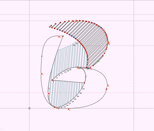
Various attempts to render the gradients properly in grayscale.
Eventually, I didn’t find the time (or patience ?) to develop the font seriously, but the basic work having been done and the use of it being possible to a certain extent, I imagined releasing my working files and the few achievements as an open-source bundle for the pleasure of some friendly nerds. What had stayed in the dominion of imagination now becomes real through the compressed file I provide today, containing a very basic font and some vector files that will allow enthusiasts to play around with what I’ve done this far, even modify, expand or improve…
It is to be noted that this creation (originally Calypso) was never meant to be a complete typeface, merely a gathering of dropped caps or swash letters intended for titling uses. This is why I didn’t try to develop a complete typeface, as some have tried, for I would consider this enterprise quite absurd. I took the time though, to draw numbers and an ampersand, as well as accents (for capitals are meant to be accented, yes).
This work is released under the terms of the Creative Commons license allowing any commercial or non-commercial use and any modification as long as the result remains under the terms of the license, i.e. shared freely (I might add, free of charge). Mentioning me as the primary author would also be nice, or let me put it this way, the license requires it. This being, I have better things to do than to sue you if you don’t.
For the record, and for the newly come audience, the name Belafonte is a direct reference to Steve Zissou’s ship in Wes Anderson’s The Life Aquatic. The ship itself refers to Jacques-Yves Cousteau’s boat, the Calypso. As for the link between the two names, I leave this riddle to your good solving care, there’s enough info about that on the internet.


Belafonte by Loïc Sander is released under the terms of the Attribution-ShareAlike Creative Commons license. Authorisations exceeding this license can be discussed at this adress: loic (at) akalollip (dot) com
‡To conlude this post, if you’re interested in the work of Roger Excoffon, I can only recommend you read the well-written and richly documented book published by Ypsilon Éditeur in november 2010, Roger Excoffon and the Olive foundry (the book is bilingual, french-english, foreword by Gerard Unger).
Yesteryear, on the matter:
bel.bir (Belafonte birnbaum)
Belafonte: encore
Paperknack (birth of Belafonte)
The digital ‘revolution’, with all the practical benefits it brought, melted down some pieces of typographic culture and practice that favored a stronger feeling of expertise. The punches, that had to be cut at the actual scale of the point-size desired for the future font, required a lot of working time, an expert’s eye and a highly trained hand. Cutting at the actual size provides the advantage of being quite sure (depending on the punchcutter’s ability) that the font is fit for the intended purpose, i.e. text, title or even bigger display type. This typeface quality has vanished through the various technical evolutions eventually turning into a ghost when phototypesetting, and later digital typesetting, were introduced. We were so amazed by the simplicity with which one could freely resize a single letter drawing that we partly forgot that the original scale has a great effect on the print quality at a chosen size. There have been, and still are, some digital typefaces built on this principle of defined scale drawings — the so-called optical sizes — but this kind of designs, because they require more time and are more constraining to use, have remain marginal. To be true, in most cases, designing optical sizes would be too much work for too poor a benefit, and one can work without it often enough not to regret the rarity of such products.
At the time of lead typesetting, printers had less font point-sizes to choose from, as the models they were founded from had to be cut one by one, whereas a computer allows to choose from an theoretical infinity of sizes, up to improbable and decimal point values. Today, naming a point-size otherwise than by its numeric value would make little sense as this value has an infinite variability, but in the past, each usual size had its little name. I found a list of these names (in french) in the Traité de la Typographie printed by Henri Fournier (a pupil of Firmin Didot) in the 1820s. As this treaty is one of the reasons why I started working on a didone, and the latter is the reason why I got interested in optical sizes, I have set this list anew with the mentioned typeface.

This list brings up questions as some of these equivalences aren’t confirmed on all accounts, notably the ‘Trismégiste’ which stands for the 33 points size in this list although it is generally referring to the 36 points size. Another inconsistency is visible on the ‘Cicero’ name that usually refers to 12 points, but stands for 11 in this list. I wondered if those were mistakes but it is unlikely as later editions show the same figures. I’d rather be prone to think these differences rely on the various measuring systems (Didot, Fournier, etc.) which where developed few decades before this publication, thus I guess, the irregularities. Anyway, to me this list can more simply serve as a reminder of the fact that our recent freedom to set type at any size is not necessarily beneficial, and that working on compositions with fixed-sizes ratios* can sometimes be of interest, would it be for the sole pleasure of exercise.
*I mention ‘ratios’ because the various type measurement systems express distinct physical sizes for the same numeric values.
‡Belafonte sleeps quietly in a computer drawer, waiting for an end that could make it useful to someone else than me, but for now, I have other priorities. Still, along with necessary fellows, I took time to go to the wood as winter asks, with striped gradient drawings in my pocket. Those are a very perfectible first trial, enjoining us to make it better the next time. The glyphs will require some corrections to allow for a proper printing use. These prints are stamped, with the according stamp ink.


So Far From Your Weapon – The Dead Weather
[Dzr]
‡I’m a victim of librus eternus, the syndrome of the unfinished sketchbook, the one that sees the others being started when he has met no end.
‡To put it simply, I have at least three serious (but not too much) typographic projects on the go, including Fengardo obviously. I haven’t the time now to pursue them as I’m busy with ‘real’ work (i.e. paid one), which isn’t a bad thing. This being, I still managed to find some time to plant a new idea in my spare hours, the idea of an exercise around my interest for the twentieth century’s advertisement typography, huge and brutal.
‡As biting at any hook of my inspirations of very uneven qualities would be dangerous for my mental health, I chose to limit the exercise in time.
‡In doing such, I would follow the path of the guy (or girl) who invented the cheapest pressurized blowgun ever, made from a scholar ink eraser and the top, transparent, part of a ball point pen (to which you had to associate a brush handle for the pushing action, paper and your saliva for the production of ammo). The idea was extremely simple but very efficient, and soon was to serve the classroom cause of maximum disorder. Loads of secondary school fell for it.
‡Far from me the idea of promoting disorder, nor inventing anything, I’m simply thinking of these exercises as an ephemeral ground for experimentation which might, at occasion, produce something useful.
‡The idea is expressed, I’m eager to see if it’ll hold.
‡I wrote quite a lot for such a tiny intention. In fact I was simply willing to introduce my new typographic attempt, simple, fat and capital. It cost about 6 hours this far (over 5 days), and I’m not planning to lend it more than 4 to declare the experiment over.

Ok, I must admit.
I drew those letters for a neighbour-cursing purpose.


