Edda
June 2nd, 2012Once upon a time
May 17th, 2012Brighton
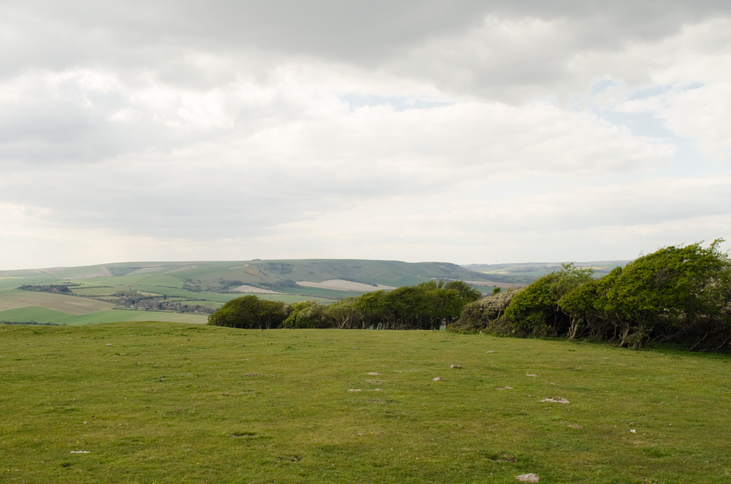
April 18th, 2012Sussex
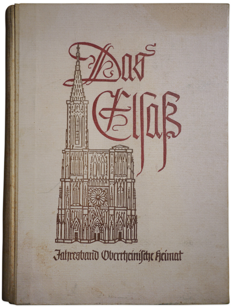
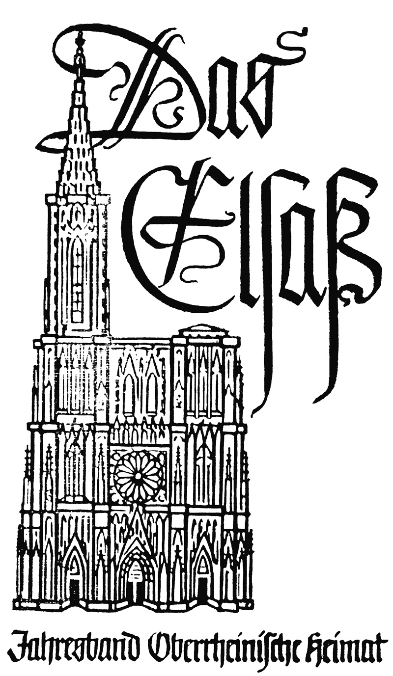
April 18th, 2012Das Elzaß
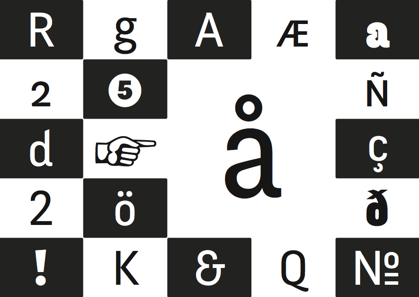
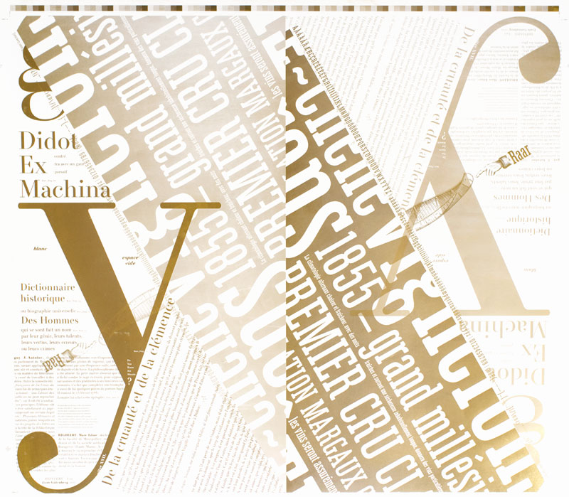
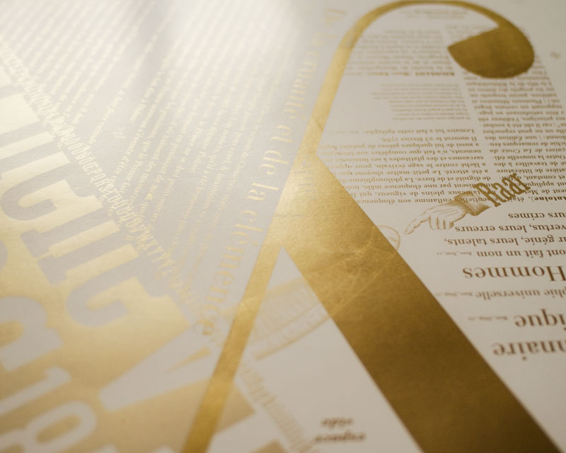
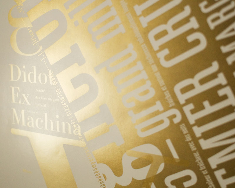
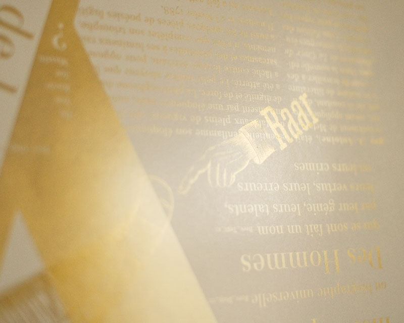
April 3rd, 2012Fengardo Neue
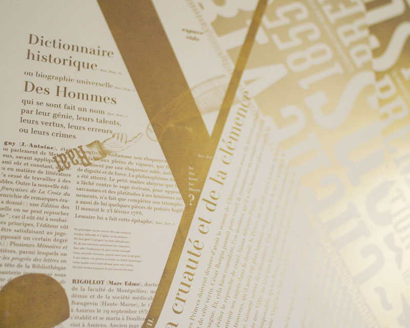
March 15th, 2012Fengardo was the first step of a hike I took on among the mountains of type design. I had good shoes, a walking stick, I met some wise shepherds who pointed me to the nice spots and useful springs. Now I feel ready to settle on the shady side of the hill, to get to know the place as my own. Fengardo Neue is a sign stuck in the ground there: “Here stops the hike. Beyond, I will walk thoroughly every day.”
I learned to draw letterforms with Fengardo, then I widened my gaze on other forms, to better understand the former, in comparison. And suddenly something changed, I felt able to decide wether a drawing seemed fine or not. It might seem a marvellous happening, but feeling the ability to judge doesn’t make the judgement necessarily good. It’s from this point forward that experience must be built, this one thing that refines judgement.
It were other shapes than Fengardo’s that made me reach first maturity. Fengardo is born of too vague a concept and of a will to assemble too many things together, which is sometimes the case in student projects. When I finally felt confident enough about my judgement and skills, I decided to sort the heads of the Hydra a bit. I never intended to make an exemplary typeface, nor one meant to be sold for that matter. Today I want to put an end to this story, closing the chapter of studies to enter the one that deals with the gathering of experience. I have other projects, more serious ones, that this time are meant to reach the market eventually, and it is on those that I wish to work fully now.
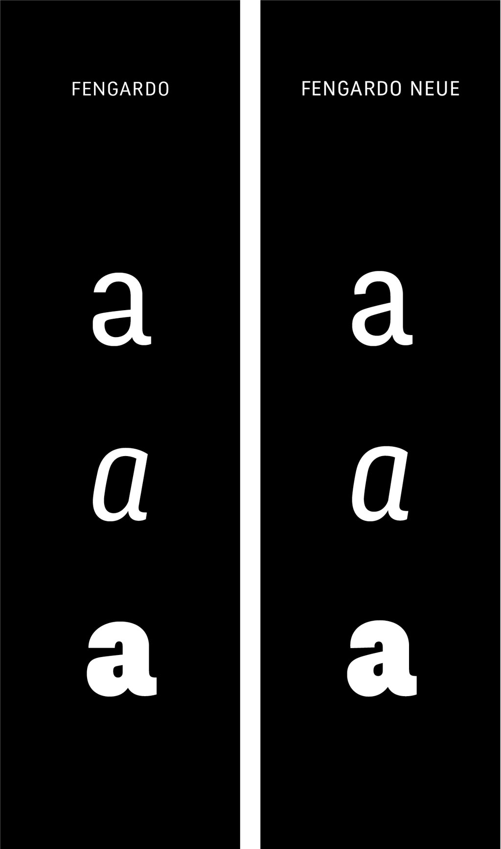
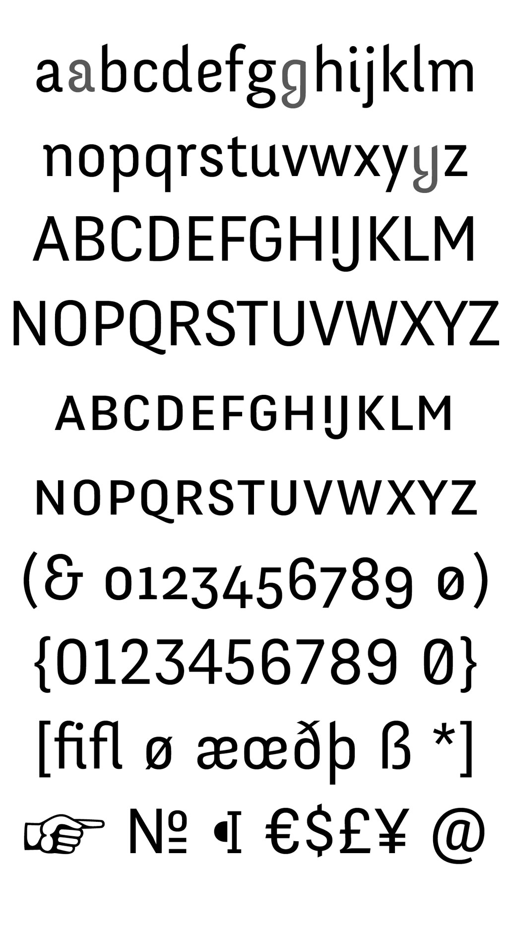
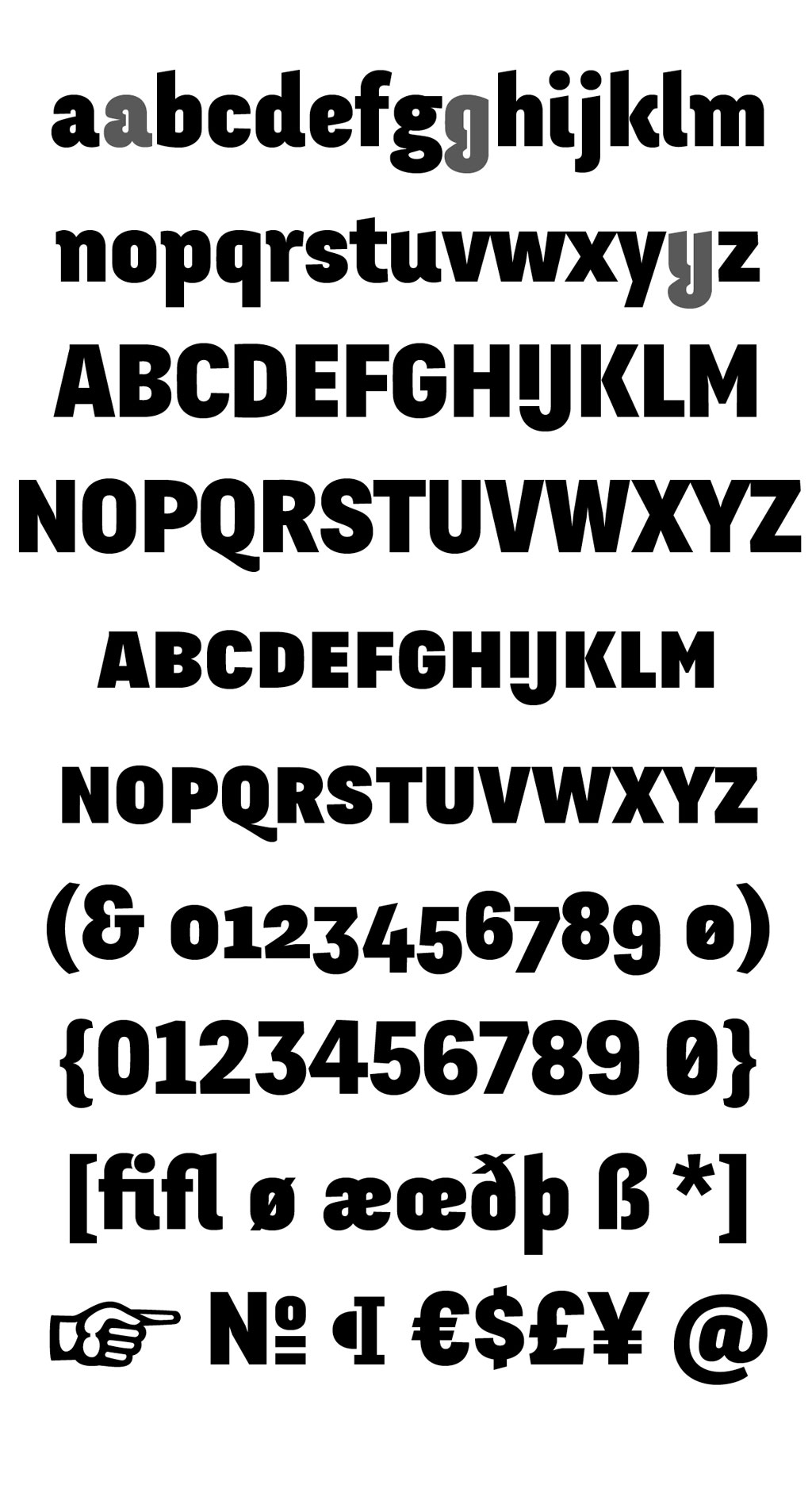
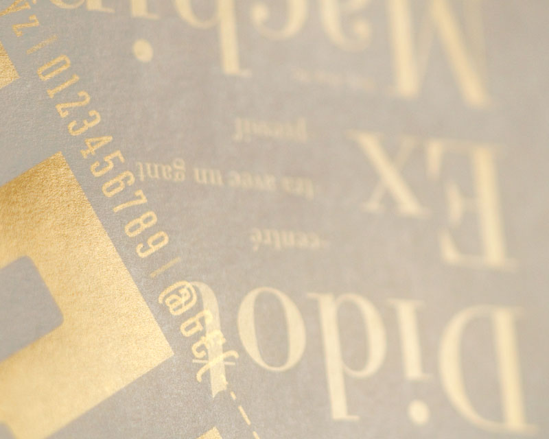
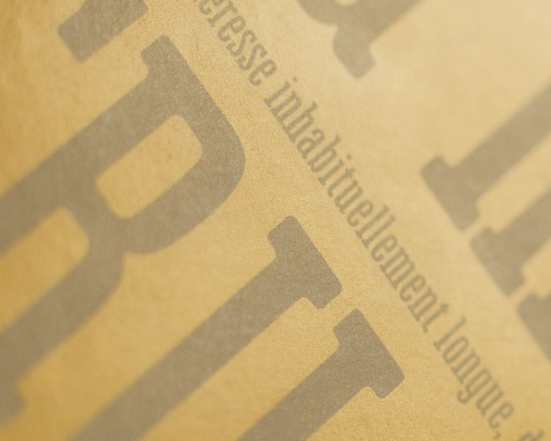
So here comes Fengardo Neue, refined version of Fengardo. For now the typeface is composed of two weights, regular and black. I noticed the italics of the former version seemed to be more successful that the other styles, which came as a surprise. This is why I shall also provide new italics; they’re on the way. I chose to add ‘Neue’ to keep the name while avoiding any confusion with the first version, and among the european possibilities to say ‘new’, the german word is the one keen to my eye.
Fengardo Neue is distributed by VTF, a somewhat insubordinate and out of the ordinary foundry that provides free fonts under the OFL SIL licence. The evolving web has extended the reach of typography in the clouds of the Internet. The network also bears the open-source ideology which is a cause I gladly befriend without feeling the will yet to actively take part in it. So as a sympathizer, this is a tiny gift to this community, I hope it will be useful to some.
This is the end of a time in my course, which will be completely past when I finish the remaining italics.
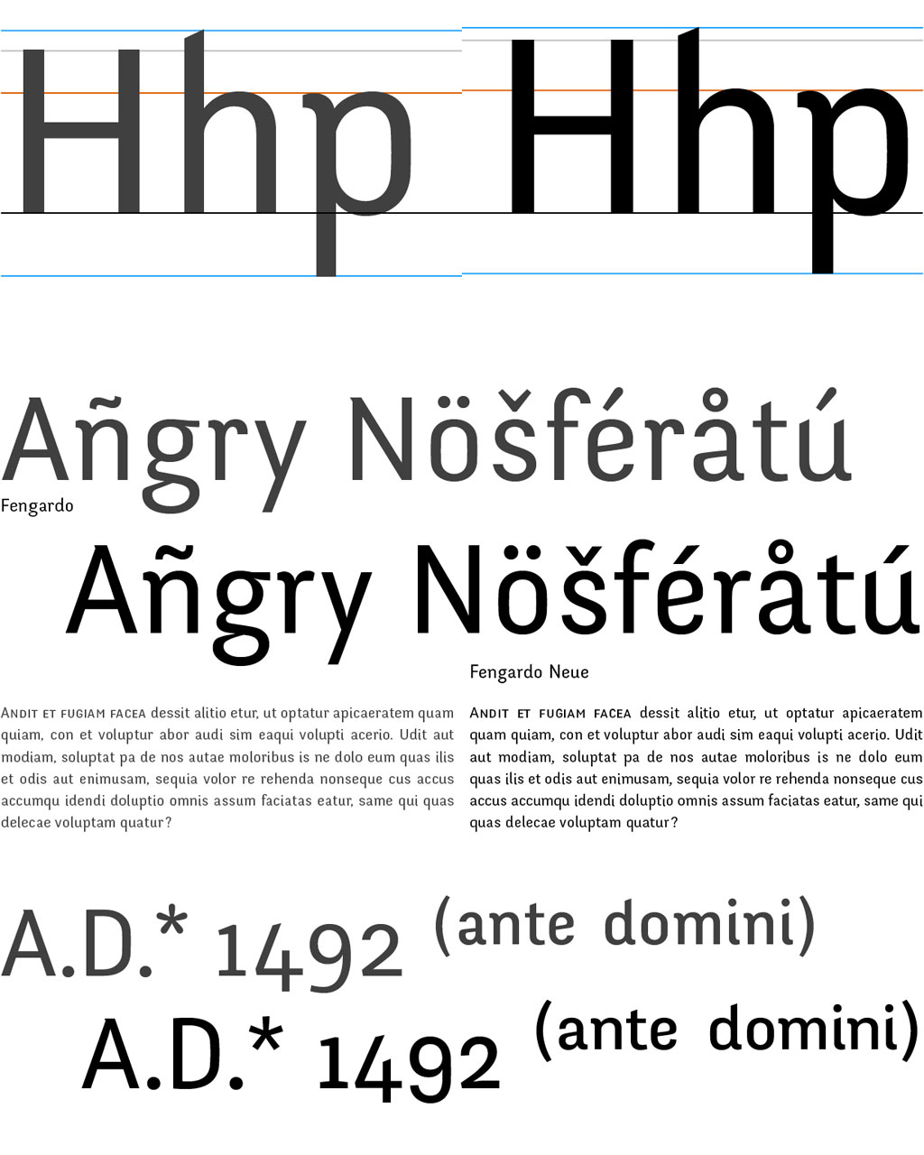
To conclude, a tiny comparison.
Fengardo Neue at Velvetyne Type Foundry
Fengardo Neue PDF Specimen
