Firmin 1796
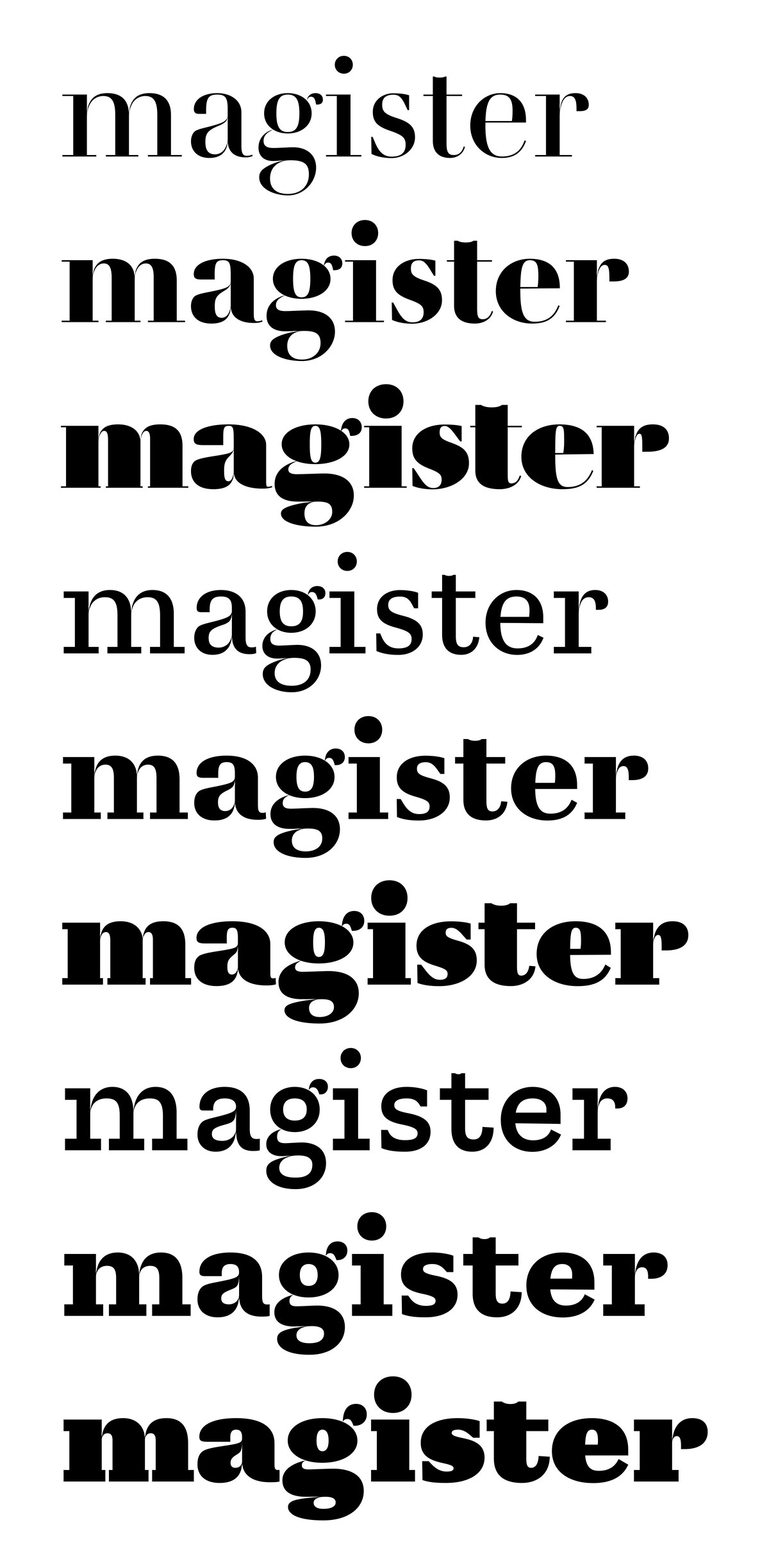
I’m slightly obsessed with Didot faces and glyph interpolation at the moment. Here’s a little experiment to see how far one can go about designing type using extrapolation. I’ve already used extrapolation quite extensively in my on-going project, Trianon, but I did approach it in a very trial-and-error way. So here I am again, trying to figure out on a lesser scale and more precisely what good extrapolation can be and how to draw in order to obtain the best possible results. The idea isn’t so much to work faster than to obtain more consistency between masters. In effect, extrapolation amplifies differences between masters and maths are brutally objective: extrapolated glyphs can be quite good revelators of discrepancies in the drawing.
Only three styles where drawn in the following attempt, the others are either interpolated or extrapolated. There are two regular styles of different contrast and a heavy one with moderate contrast. The initial style — also the first in this list — is based on a face cut by Firmin Didot in 1796 and first used that same year for an edition of De la Rochefoucault’s Maximes et réflexions morales [1].

[1] Sébastien Morlighem, The ‘modern face’ in France and Great Britain, 1781–1825: typography as an ideal of progress, 2014