Corpus
The digital ‘revolution’, with all the practical benefits it brought, melted down some pieces of typographic culture and practice that favored a stronger feeling of expertise. The punches, that had to be cut at the actual scale of the point-size desired for the future font, required a lot of working time, an expert’s eye and a highly trained hand. Cutting at the actual size provides the advantage of being quite sure (depending on the punchcutter’s ability) that the font is fit for the intended purpose, i.e. text, title or even bigger display type. This typeface quality has vanished through the various technical evolutions eventually turning into a ghost when phototypesetting, and later digital typesetting, were introduced. We were so amazed by the simplicity with which one could freely resize a single letter drawing that we partly forgot that the original scale has a great effect on the print quality at a chosen size. There have been, and still are, some digital typefaces built on this principle of defined scale drawings — the so-called optical sizes — but this kind of designs, because they require more time and are more constraining to use, have remain marginal. To be true, in most cases, designing optical sizes would be too much work for too poor a benefit, and one can work without it often enough not to regret the rarity of such products.
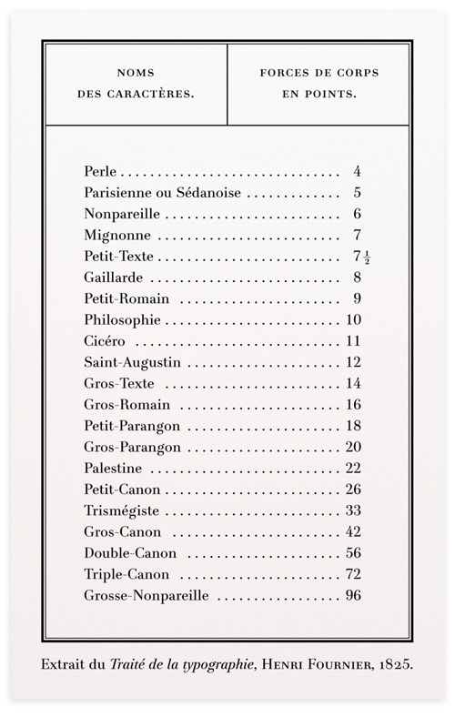
At the time of lead typesetting, printers had less font point-sizes to choose from, as the models they were founded from had to be cut one by one, whereas a computer allows to choose from an theoretical infinity of sizes, up to improbable and decimal point values. Today, naming a point-size otherwise than by its numeric value would make little sense as this value has an infinite variability, but in the past, each usual size had its little name. I found a list of these names (in french) in the Traité de la Typographie printed by Henri Fournier (a pupil of Firmin Didot) in the 1820s. As this treaty is one of the reasons why I started working on a didone, and the latter is the reason why I got interested in optical sizes, I have set this list anew with the mentioned typeface.
This list brings up questions as some of these equivalences aren’t confirmed on all accounts, notably the ‘Trismégiste’ which stands for the 33 points size in this list although it is generally referring to the 36 points size. Another inconsistency is visible on the ‘Cicero’ name that usually refers to 12 points, but stands for 11 in this list. I wondered if those were mistakes but it is unlikely as later editions show the same figures. I’d rather be prone to think these differences rely on the various measuring systems (Didot, Fournier, etc.) which where developed few decades before this publication, thus I guess, the irregularities. Anyway, to me this list can more simply serve as a reminder of the fact that our recent freedom to set type at any size is not necessarily beneficial, and that working on compositions with fixed-sizes ratios* can sometimes be of interest, would it be for the sole pleasure of exercise.
*I mention ‘ratios’ because the various type measurement systems express distinct physical sizes for the same numeric values.
