
Don’t tease pears
October 19th, 2010So Far From Your Weapon – The Dead Weather
[Dzr]
‡I’m a victim of librus eternus, the syndrome of the unfinished sketchbook, the one that sees the others being started when he has met no end.
‡To put it simply, I have at least three serious (but not too much) typographic projects on the go, including Fengardo obviously. I haven’t the time now to pursue them as I’m busy with ‘real’ work (i.e. paid one), which isn’t a bad thing. This being, I still managed to find some time to plant a new idea in my spare hours, the idea of an exercise around my interest for the twentieth century’s advertisement typography, huge and brutal.
‡As biting at any hook of my inspirations of very uneven qualities would be dangerous for my mental health, I chose to limit the exercise in time.
‡In doing such, I would follow the path of the guy (or girl) who invented the cheapest pressurized blowgun ever, made from a scholar ink eraser and the top, transparent, part of a ball point pen (to which you had to associate a brush handle for the pushing action, paper and your saliva for the production of ammo). The idea was extremely simple but very efficient, and soon was to serve the classroom cause of maximum disorder. Loads of secondary school fell for it.
‡Far from me the idea of promoting disorder, nor inventing anything, I’m simply thinking of these exercises as an ephemeral ground for experimentation which might, at occasion, produce something useful.
‡The idea is expressed, I’m eager to see if it’ll hold.
‡I wrote quite a lot for such a tiny intention. In fact I was simply willing to introduce my new typographic attempt, simple, fat and capital. It cost about 6 hours this far (over 5 days), and I’m not planning to lend it more than 4 to declare the experiment over.

Ok, I must admit.
I drew those letters for a neighbour-cursing purpose.
Corbeille
September 7th, 2010‡I was on board of a train rolling through the countryside and had the firm intention of giving a book back. As I knew the landscape quite well, I decided to give the mentioned book another look : it was a facsimile of Geoffroy Tory’s Champfleury, printed in 1529.
‡The book had been lent to me by the typophile colleague I was paying a visit to, typo-colleague who must have thought my typomania was a reason good enough for me to enjoy its content. The exact title, in french, is: Art et science de la vraie proportion des lettres, or in english: Art and science of the truthful proportion of letters. Even for someone accustomed to old prints, the typesetting and orthographic irregularity are quite demanding to read. And before the author goes on the subject of what makes perfect letters to his mind, he tries to demonstrate how the french language has all the attributes of a perfect expression of excellence, which must be quite natural, obviously.
‡This marvelous demonstration can be read with some irony as the french wielded by the author, for which he himself has great esteem, can look a bit anarchic to contemporary eyes.
‡To his defense, we can add that the Académie Française (an institution entitled to give, adapt and preserve the rules of french language), to which Richelieu has given the authority to resolve the problem of irregular typographic and orthographic writing, was founded only a century later. Confirming the role Richelieu had dreamt for this institution, it is not unusual to read in french books printed between 1600 and 1800 that french has to be the rightful heir of latin, as the French nation is supposedly descending directly from the Roman Empire. A very old fantasy that was a foundation to most of the wars France has been implicated in until the end of the nineteenth century.
‡So proud are we, frenchmen, of our Republics, our Senates; another dwarf even reinstated the roman title of Tribune, shorly before inventing the Legion of Honor (a decoration still pined on proud citizen’s torso nowadays). All this has become quite common to us, thanks to a quite Frank education, but the way this book’s author demonstrates this relation between french and latin is even brighter than that. With the credit of some faith-worthy authors, he explains that the Romans, and even the Greeks, were nice people but they could only be similar to cheap wine when France has naturally the quality of a Saint-Émilion. And to give weight to this declaration, he refers to the myth of Hercules.
‡I’ll spare the details on why Hercules a deeply wise & reasoned man is, thus having to be french, and I’ll simply point the fact on which the demonstration is based, that is to say that Hercules, when named by latin & greek authors is always called Hercules Gallicus, and not Hercules Latinus nor Hercules Græcus. Anyone has to admit this is a proof that can’t be doubted…
‡Personnaly, I’m quite amused by such details, and I can bear to be the only one in this case. Such elements highlight some roots of a french mentality and pride that often exasperates me but that I mostly laugh about.
‡And to those that History lessons haven’t killed yet, I suggest a little compared reading to see what linguistic and typographic changes have happened throughout five hundred years.


Racines
August 30th, 2010Goodnight Bad Morning – The Kills
[Dzr]


‡{ Puy des Gouttes, Puy Chopine, Puy de Louchadière, Puy de la Coquille.
Ritornare
August 21st, 2010Fuori dal mondo – Ludovico Einaudi
[Dzr]

‡En terre cisalpine, j’ai respiré l’air du changement, vu quelques fantômes d’Histoire et pris un plaisir particulier à fuir la rôtisserie. Je trouve le brun sale, fieffé royaliste que je suis. Mais même sans fuir les bancs de la crèmation, je n’aurais craint aucune peine solaire puisque par bonheur les nuages avaient l’avantage et prenaient à cœur leur rôles d’ombrages sinophiles, orfèvres d’une lumière généreuse.
‡D’abord en montagne, j’ai pu me recueillir sur un lieu d’incarcération du légendaire homme au masque de fer et de Fouquet, qui est certainement responsable de toute la débauche qui règne en France depuis qu’il a déplacé la virgule sur son compte en Vaux, aux dépens du contribué royal.
‡Après cette larme versée sur la fortune de Mazarin et l’héritage de Louis Soleil que ça n’a pas trop gêné, il a fallu rejoindre les eaux et là s’est produit ce qui me surprend presque chaque année : un anniversaire.
‡Le jour amorçant ma vingt-quatrième année a débuté à l’aurore, sur un orage d’été. Mon esprit était dans ses affaires, mon cœur rangeait sa cellule et la pluie sur cette terre plus coutumière de l’astre qu’elle chante était un cadeau suffisant. Après avoir gagné mon niveau, j’ai passé deux jours dans une bonne auberge afin de décider à quelles caractéristiques j’allais attribuer mes cinq points: ( 2: typo, 1: vaisselle, 1: norrois 1: assimilation des vitamines ).
‡Puis je suis allé voir la mer, pour la seule raison qu’elle était furieuse. Rassasié d’embruns je suis retourné à la bonne auberge, je me suis entraîné au saut à l’élastique en salle et j’ai emménagé dans un palais de marbre, mais pas n’importe lequel puisque c’est celui de David et que lui-même n’est plus tout jeune.
‡Ensuite, ou avant je ne sais plus trop, j’ai pris la route de Parme, j’avais un peu faim. La visite fût brève mais riche en émotions. J’ai enfin trouvé une Florence modeste, avec –90% de touristes; bon, David n’y a jamais été, ce qui est quand même dommage. En plus de cette découverte qui vaut son pesant de carrelage, j’ai appris en entrant dans une église – l’eusses-tu cru – que je faisais malgré moi un pèlerinage sur les terres glorieuses de Giambattista Bodoni, détail cartographique qui m’avait échappé jusque là. J’en fus fort ému et je dû mourir sur le champ – enfin, sur le sol de la nef – d’où la fin de ce récit, immédiate.


 † Carrara

 † Parma
‡« I was born in a summer storm, I live there still. »
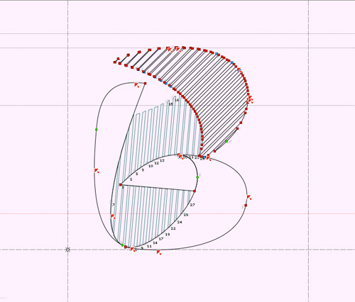
Fengardo, free font*
July 24th, 2010
‡…to download.
‡Today is just another day, except today, I am turning into George Strait and I Give It Away !
‡I had a difficult pregnancy. It will have required my sunday perfectionism to come to an end and the wise voices of some friendly peers, for me to decide this font is finished and ready for a (first) release.
‡By ‘release’ I mean giving away for free and there are several reasons for that. The first of all is that I’ve always felt like a typographic Mitch Buchannon, a probably nice bloke but crippled by ambitions too grand for his capacities. Then, I’m from this shitty all-free generation which never understood that music, movies and even typography have to be paid, as they are the result of much fuss and hard work. Induced by my condition, I have little faith in most of the usual economical models going on in the type world. The one that convinced me the most this far was tried by Jos Buivenga, who releases the basic weights of his fonts for free and gives the rest for a few bucks away. I find it’s useful for the trial purpose it fulfills, the user can practically start to explore the type family which might ease the buying of the whole, eventually. This being said, I’ve no idea how good this method has turned out to be and I thought hearing he didn’t try to make a living out of it, at first. This last point is interesting to me as I’m not trying either. Anyway, I’m not saying I can provide type design work of professional quality, especially regarding the high standards that can be expected in matters of kerning and hinting, for instance.
‡I had first imagined I could release a lightweight version with a basic character set containing only the strict minimum for most usages. And then I realized how absurd this idea was as I had drawn all the rest, plus, I would have had to clean the Opentype functions, which I’m far too lazy to even start thinking of.

‡So here comes the healthy little baby, weighting 400+ glyphs, basic set, old style figures as default, lining figures (tabular and proportional), small caps, some historical variants, titling variants, etc. Just for the fun part of a list, the font can be used for the following languages:
albanian, basque, catalan, danish, dutch, english, estonian, færoese, finnish, french, galician, german, greek, indonesian, irish, icelandic, italian, malesian, manx, norvegian bokmål, norvegian nynorsk, portugese, somali, spanish, swahili, swedish.
The language before last is my favorite, as it allows the Lion King to woo his future wife with Fengardo, in his native language.

‡Linguistic and mediocre joke set aside, I have to thank the silent actors of this production, starting with my teachers who where kind enough to inoculate the typomania into me, my friends who suffer me, the ones who educate me, those who kindle my typographic verve and the beta-testers who liked the typeface even in the time of it utter ugliness.
‡Ok now, let’s not pay the bill:


Fengardo by Loïc Sander is provided under the terms of the licence Creative Commons BY-ND 3.0. If you need any authorizations beyond this licence, we can discuss it, follow the sign: loic (a) akalollip (dot) com
<black teaser>

L’accessible…
June 24th, 2010
Flanders
May 23rd, 2010Boom Boom – John Lee Hooker
[Dzr]
{Moerdijk Brug}

‡The picture & sound of the road to The Hague, following the discovery of one of the most well-preserved inheritance of typographic History; presses, books & punches for proof.
{Antwerpen, Plantin-Moretus Museum}


{Breda, outsides early}

‡And concerning the Graphic Desin Museum and festival, I used my eyes more than the camera. Remains only the hint of a swift theft that could have gone unnoticed.