Archive for the ‘Caractères / Type’ Category

Corbeille

Tuesday, September 7th, 2010

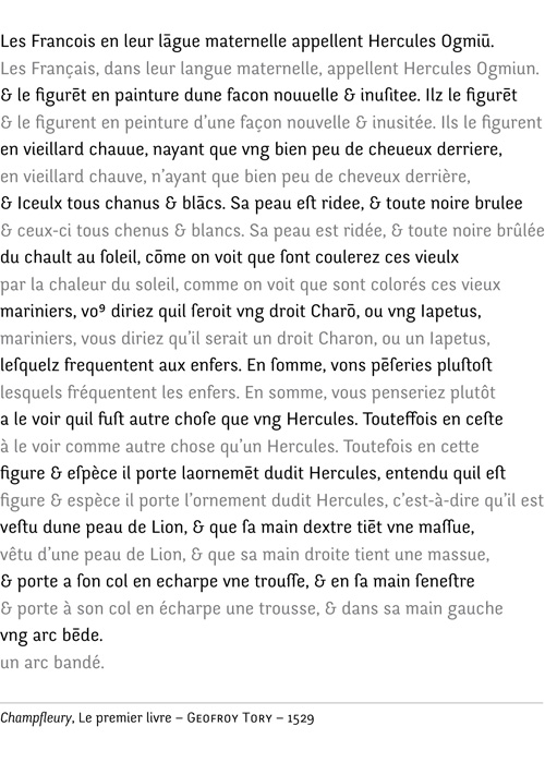
I was on board of a train rol­ling through the coun­try­side and had the firm inten­tion of giving a book back. As I knew the land­scape quite well, I deci­ded to give the men­tio­ned book ano­ther look : it was a fac­si­mile of Geof­froy Tory’s Champ­fleury, prin­ted in 1529.

The book had been lent to me by the typo­phile col­league I was paying a visit to, typo-colleague who must have thought my typo­ma­nia was a rea­son good enough for me to enjoy its content. The exact title, in french, is: Art et science de la vraie pro­por­tion des lettres, or in english: Art and science of the tru­th­ful pro­por­tion of let­ters. Even for someone accus­to­med to old prints, the type­set­ting and ortho­gra­phic irre­gu­la­rity are quite deman­ding to read. And before the author goes on the sub­ject of what makes per­fect let­ters to his mind, he tries to demons­trate how the french lan­guage has all the attri­butes of a per­fect expres­sion of excel­lence, which must be quite natu­ral, obviously.

This mar­ve­lous demons­tra­tion can be read with some irony as the french wiel­ded by the author, for which he him­self has great esteem, can look a bit anar­chic to contem­po­rary eyes.

To his defense, we can add that the Aca­dé­mie Fran­çaise (an ins­ti­tu­tion entit­led to give, adapt and pre­serve the rules of french lan­guage), to which Riche­lieu has given the autho­rity to resolve the pro­blem of irre­gu­lar typo­gra­phic and ortho­gra­phic wri­ting, was foun­ded only a cen­tury later. Confir­ming the role Riche­lieu had dreamt for this ins­ti­tu­tion, it is not unu­sual to read in french books prin­ted bet­ween 1600 and 1800 that french has to be the right­ful heir of latin, as the French nation is sup­po­sedly des­cen­ding directly from the Roman Empire. A very old fan­tasy that was a foun­da­tion to most of the wars France has been impli­ca­ted in until the end of the nine­teenth century.

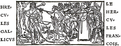
So proud are we, french­men, of our Repu­blics, our Senates; ano­ther dwarf even reins­ta­ted the roman title of Tri­bune, shorly before inven­ting the Legion of Honor (a deco­ra­tion still pined on proud citizen’s torso nowa­days). All this has become quite com­mon to us, thanks to a quite Frank edu­ca­tion, but the way this book’s author demons­trates this rela­tion bet­ween french and latin is even brigh­ter than that. With the cre­dit of some faith-worthy authors, he explains that the Romans, and even the Greeks, were nice people but they could only be simi­lar to cheap wine when France has natu­rally the qua­lity of a Saint-Émilion. And to give weight to this decla­ra­tion, he refers to the myth of Hercules.

I’ll spare the details on why Her­cules a dee­ply wise & rea­so­ned man is, thus having to be french, and I’ll sim­ply point the fact on which the demons­tra­tion is based, that is to say that Her­cules, when named by latin & greek authors is always cal­led Her­cules Gal­li­cus, and not Her­cules Lati­nus nor Her­cules Græ­cus. Anyone has to admit this is a proof that can’t be doubted…

Per­son­naly, I’m quite amu­sed by such details, and I can bear to be the only one in this case. Such ele­ments high­light some roots of a french men­ta­lity and pride that often exas­pe­rates me but that I mostly laugh about.

And to those that His­tory les­sons haven’t killed yet, I sug­gest a lit­tle com­pa­red rea­ding to see what lin­guis­tic and typo­gra­phic changes have hap­pe­ned throu­ghout five hun­dred years.
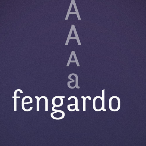
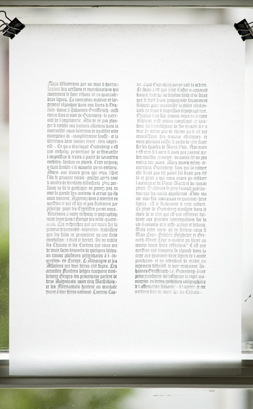
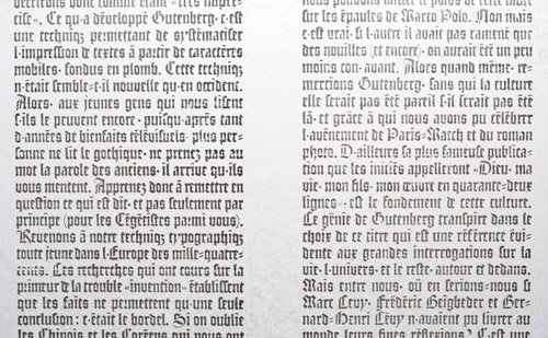
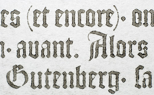
Fengardo, free font*

Saturday, July 24th, 2010

…to down­load.

Today is just ano­ther day, except today, I am tur­ning into George Strait and I Give It Away !

I had a dif­fi­cult pre­gnancy. It will have requi­red my sun­day per­fec­tio­nism to come to an end and the wise voices of some friendly peers, for me to decide this font is fini­shed and ready for a (first) release.

By ‘release’ I mean giving away for free and there are seve­ral rea­sons for that. The first of all is that I’ve always felt like a typo­gra­phic Mitch Buchan­non, a pro­ba­bly nice bloke but crip­pled by ambi­tions too grand for his capa­ci­ties. Then, I’m from this shitty all-free gene­ra­tion which never unders­tood that music, movies and even typo­gra­phy have to be paid, as they are the result of much fuss and hard work. Indu­ced by my condi­tion, I have lit­tle faith in most of the usual eco­no­mi­cal models going on in the type world. The one that convin­ced me the most this far was tried by Jos Bui­venga, who releases the basic weights of his fonts for free and gives the rest for a few bucks away. I find it’s use­ful for the trial pur­pose it ful­fills, the user can prac­ti­cally start to explore the type family which might ease the buying of the whole, even­tually. This being said, I’ve no idea how good this method has tur­ned out to be and I thought hea­ring he didn’t try to make a living out of it, at first. This last point is inter­es­ting to me as I’m not trying either. Any­way, I’m not saying I can pro­vide type design work of pro­fes­sio­nal qua­lity, espe­cially regar­ding the high stan­dards that can be expec­ted in mat­ters of ker­ning and hin­ting, for instance.
I had first ima­gi­ned I could release a light­weight ver­sion with a basic cha­rac­ter set contai­ning only the strict mini­mum for most usages. And then I rea­li­zed how absurd this idea was as I had drawn all the rest, plus, I would have had to clean the Open­type func­tions, which I’m far too lazy to even start thin­king of.


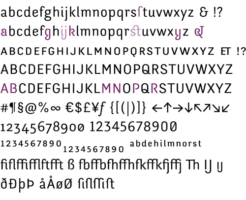
So here comes the heal­thy lit­tle baby, weigh­ting 400+ glyphs, basic set, old style figures as default, lining figures (tabu­lar and pro­por­tio­nal), small caps, some his­to­ri­cal variants, tit­ling variants, etc. Just for the fun part of a list, the font can be used for the fol­lo­wing lan­guages:
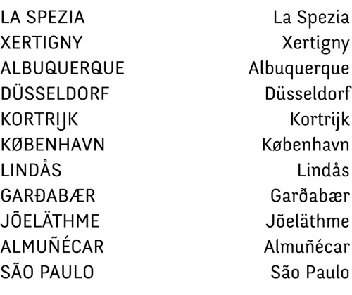
alba­nian, basque, cata­lan, danish, dutch, english, esto­nian, færoese, fin­nish, french, gali­cian, ger­man, greek, indo­ne­sian, irish, ice­lan­dic, ita­lian, male­sian, manx, nor­ve­gian bokmål, nor­ve­gian nynorsk, por­tu­gese, somali, spa­nish, swa­hili, swe­dish.
The lan­guage before last is my favo­rite, as it allows the Lion King to woo his future wife with Fen­gardo, in his native language.

Lin­guis­tic and mediocre joke set aside, I have to thank the silent actors of this pro­duc­tion, star­ting with my tea­chers who where kind enough to ino­cu­late the typo­ma­nia into me, my friends who suf­fer me, the ones who edu­cate me, those who kindle my typo­gra­phic verve and the beta-testers who liked the type­face even in the time of it utter ugliness.

Ok now, let’s not pay the bill:

[ Down­load Fen­gardo ]

Contrat Creative Commons

Fen­gardo by Loïc San­der is pro­vi­ded under the terms of the licence Crea­tive Com­mons BY-ND 3.0. If you need any autho­ri­za­tions beyond this licence, we can dis­cuss it, fol­low the sign: loic (a) aka­lol­lip (dot) com

<black tea­ser>

> Radio extract (Dzr)

Flanders

Sunday, May 23rd, 2010

Boom Boom – John Lee Hoo­ker
[Dzr]

{Moer­dijk Brug}

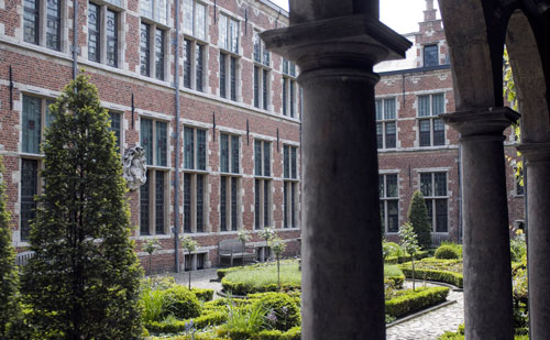
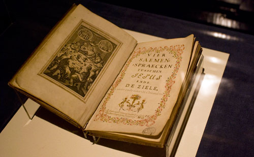
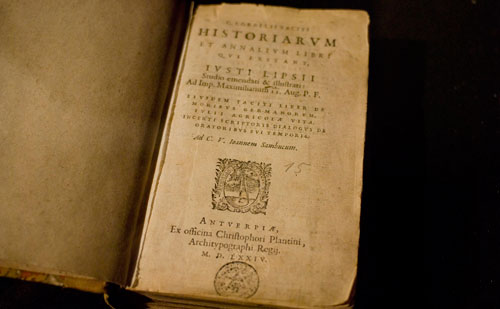
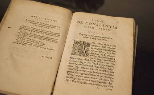
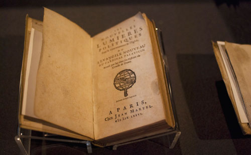
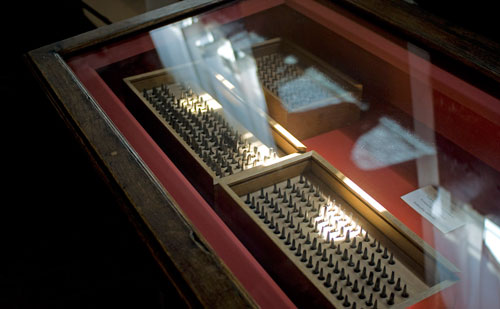
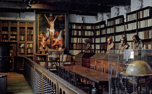
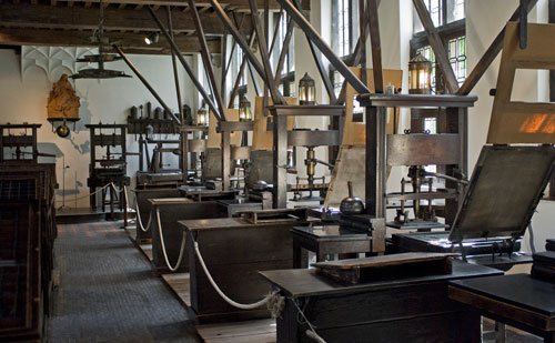
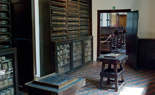
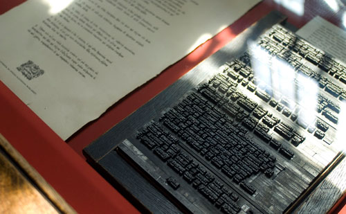
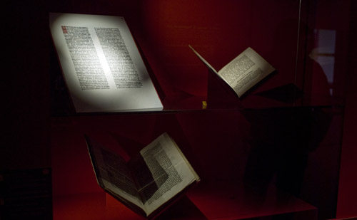
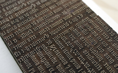
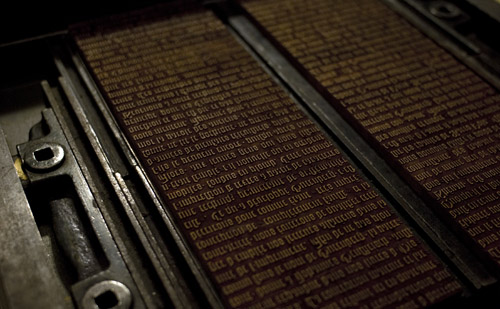
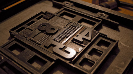
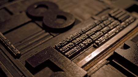
The pic­ture & sound of the road to The Hague, fol­lo­wing the dis­co­very of one of the most well-preserved inhe­ri­tance of typo­gra­phic His­tory; presses, books & punches for proof.

{Ant­wer­pen, Plantin-Moretus Museum}

{Breda, out­sides early}

And concer­ning the Gra­phic Desin Museum and fes­ti­val, I used my eyes more than the camera. Remains only the hint of a swift theft that could have gone unnoticed.

…Just a couple

Thursday, May 13th, 2010

Boys – Bau­haus
[Dzr]

A collab*orationn set in camou­flage during the Night of Museums.

For a few millimeters more

Wednesday, May 12th, 2010

Grin­nin’ in your face – Son House
[Dzr]


Wirkliches Birnbaum Holz diesmal

Wednesday, March 17th, 2010

Grin­ding Halt – The Cure
[Dzr]

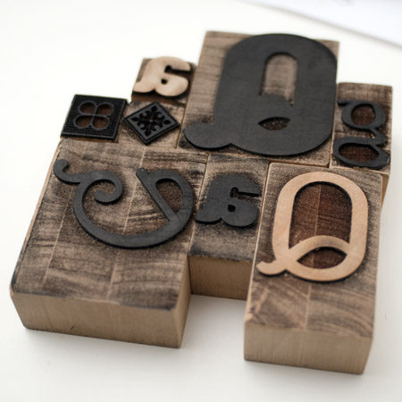
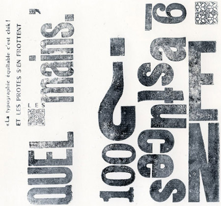
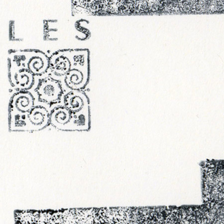
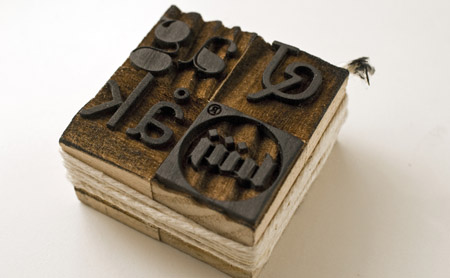
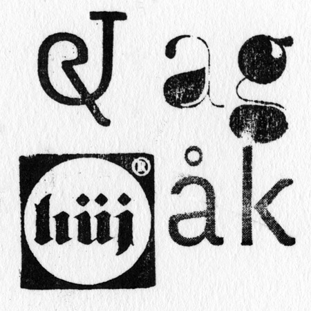
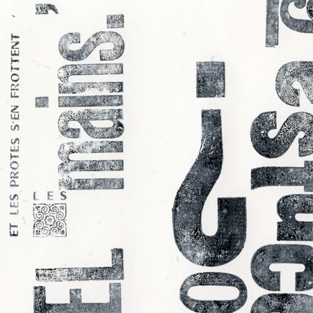
Impres­sions dilet­tantes, inap­pro­priées, au tam­pon encreur.
Bois de bout. Poirier.

_DSC0107

.
print 1print 2

print 4

.

print 5 print

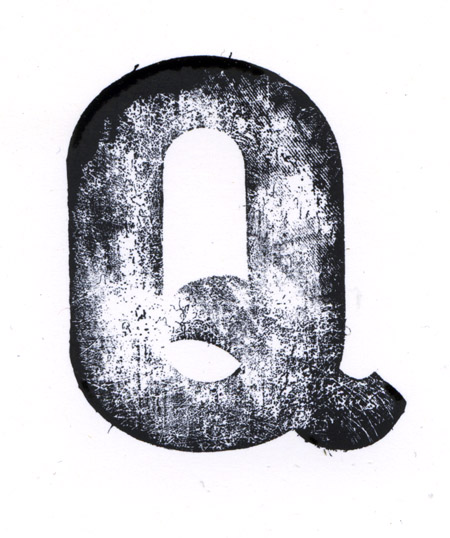
Q.Fengardo.black alte­red
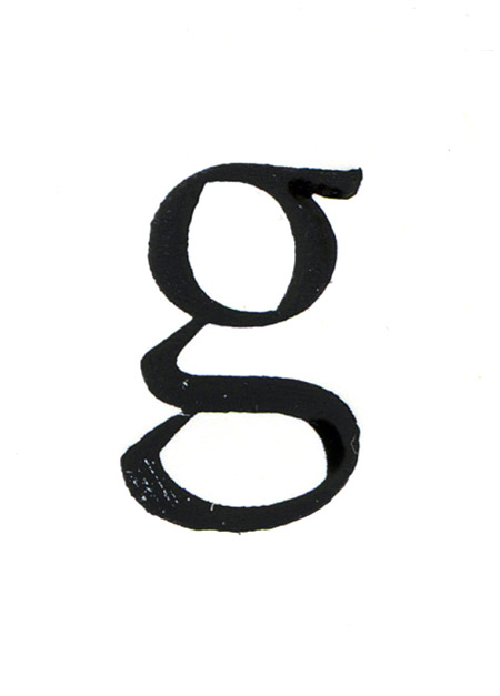
g.untitled44
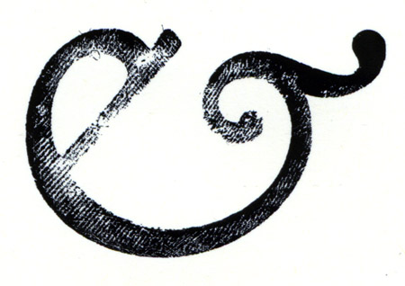
&.Joos
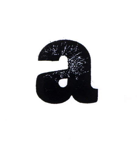
a.FengardoBlack
vignette

[Light Inva­ders], pro­posé par Super­script.
Ma rapide contri­bu­tion: http://www.light-invaders.com/?invader/view/242

impressions

Wednesday, February 10th, 2010

Human Remains – Tom McRae
[Dee­zer]

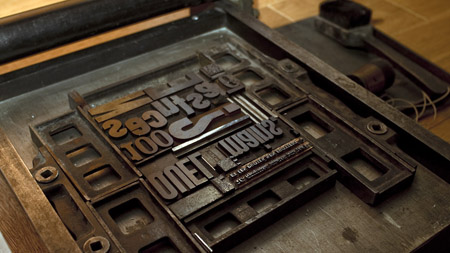
Divers carac­tères en bois et du Cham­bord demi-gras corps 16 gras corps 12 {mes­sage désu­bli­mi­na­lisé: « Vive Roger ! »}. Une pro­duc­tion Luzern & Steinmetz.

print1_DSC0003-blgprint2_DSC0013-blgprint3print4_DSC0151-blg_DSC0154-blg_DSC0148-blg

Remer­cie­ments: La Pomme & la Lune.

Et 330 marches plus haut, puis plus bas.

_DSC0119-bblgrohan2blg

err. Lindenbaum

Saturday, January 30th, 2010

In the Pines – Joan Baez
[Dee­zer]

_DSC0017-blglaser2-blg_DSC0018-blglaser-blg_DSC0019-blg