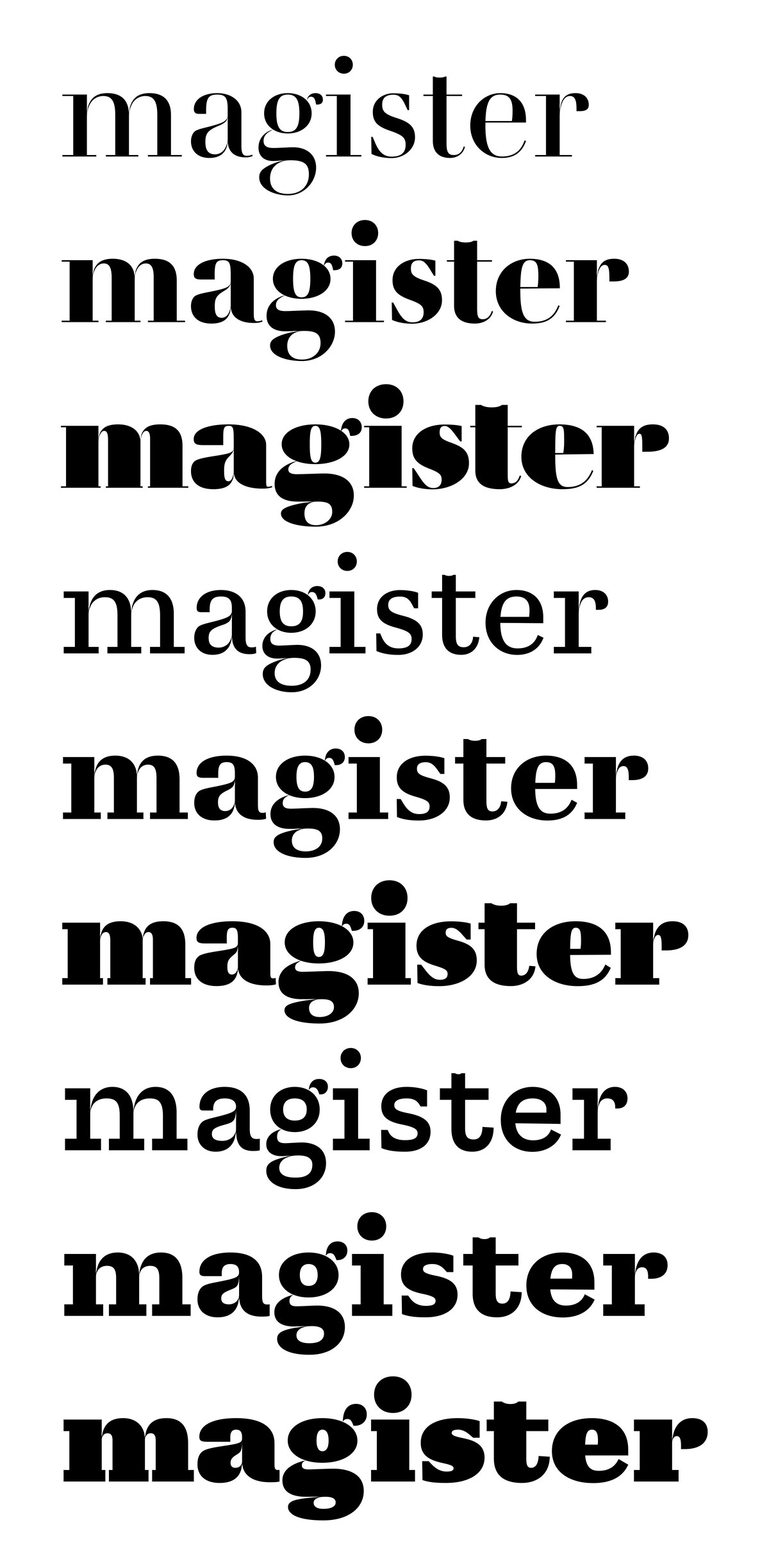
Archive for the ‘Global’ Category

Firmin 1796

Sunday, March 1st, 2015

I’m slightly obses­sed with Didot faces and glyph inter­po­la­tion at the moment. Here’s a lit­tle expe­riment to see how far one can go about desi­gning type using extra­po­la­tion. I’ve already used extra­po­la­tion quite exten­si­vely in my on-going pro­ject, Tri­anon, but I did approach it in a very trial-and-error way. So here I am again, trying to figure out on a les­ser scale and more pre­ci­sely what good extra­po­la­tion can be and how to draw in order to obtain the best pos­sible results. The idea isn’t so much to work fas­ter than to obtain more consis­tency bet­ween mas­ters. In effect, extra­po­la­tion ampli­fies dif­fe­rences bet­ween mas­ters and maths are bru­tally objec­tive: extra­po­la­ted glyphs can be quite good reve­la­tors of dis­cre­pan­cies in the drawing.

Only three styles where drawn in the fol­lo­wing attempt, the others are either inter­po­la­ted or extra­po­la­ted. There are two regu­lar styles of dif­ferent contrast and a heavy one with mode­rate contrast. The ini­tial style — also the first in this list — is based on a face cut by Fir­min Didot in 1796 and first used that same year for an edi­tion of De la Rochefoucault’s Maximes et réflexions morales [1].

firmin-didot-1796

[1] Sébas­tien Mor­li­ghem, The ‘modern face’ in France and Great Bri­tain, 1781–1825: typo­gra­phy as an ideal of pro­gress, 2014

Strasbourg Neustadt, Num.

Monday, September 22nd, 2014
1 2 3 4 5 6 7 8

+3000 km

Sunday, August 26th, 2012

Once upon a time

Thursday, May 17th, 2012

Sto­ries, myths and signs. Tales through angles and perspective.


Skip James

Wednesday, November 9th, 2011

[Devil Got My Woman – Skip James]

Photo: Album cover, Van­guard Vision­na­ries: Skip James

Peachy dawn

Tuesday, September 20th, 2011

Roll on John – Bob Dylan

Ar’men

Tuesday, September 13th, 2011

[Gone Under Sea — Elec­tre­lane]

It’s quite a grey day, and when colours are mis­sing, I’d rather be next to an ocean, but I’m not even close yet.

Thus, on this dull eve­ning, I loo­ked for solace in the com­pany of one of the most legen­dary ligh­thouses of the french atlan­tic coast, Ar’men, which in the bre­ton tongue means, the rock. It is amongst the rare off­shore ligh­thouses and one of those  kee­pers refer­red to as ‘Hell’. There were also ‘Pur­ga­to­ries’ and ‘Para­dises’, obviously. And about this par­ti­cu­lar ligh­thouse, I found this video of 1962, shortly des­cri­bing the life in this inha­bi­ted bea­con which is meant to keep ships from wre­cking on the shal­lows west­ward from the Isle of Sein.

I’m post­ing it because I enjoyed as much the topic than the gra­phics star­ting and ending the sub­ject. They dis­play type­faces by Roger Excof­fon, namely Antique Olive Nord for the titles, and Cham­bord for the ending credits.

L’accessible…

Thursday, June 24th, 2010

…devient plus que possible.

Ça se passe par là.